
The Challenge
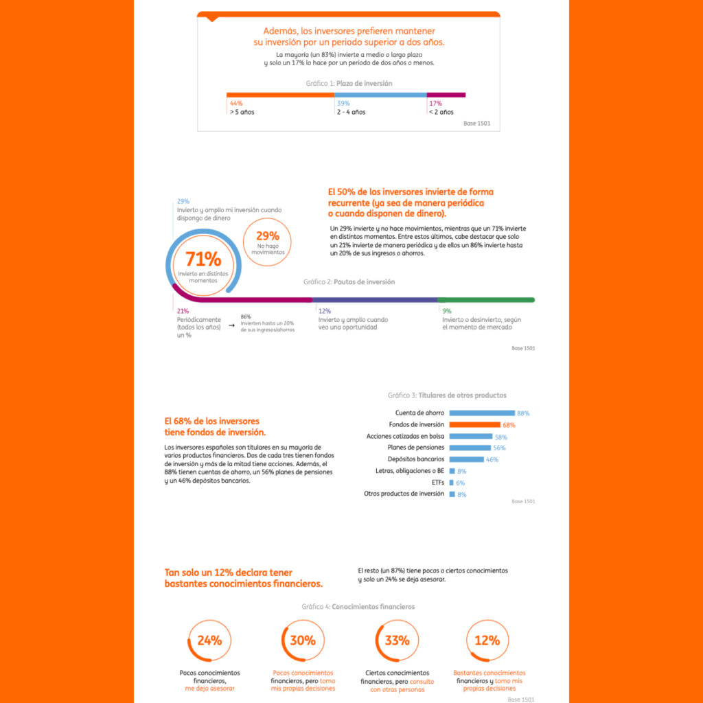
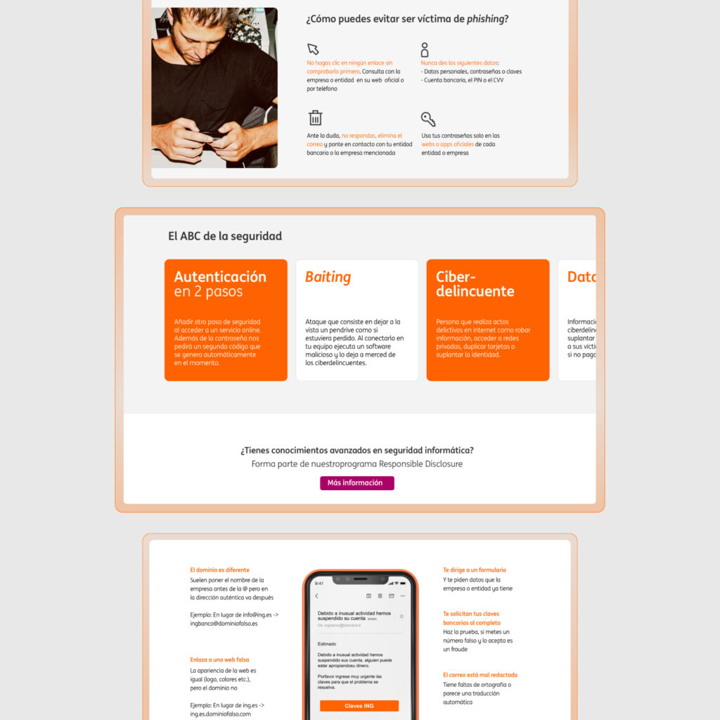
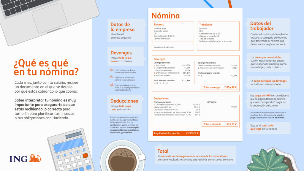
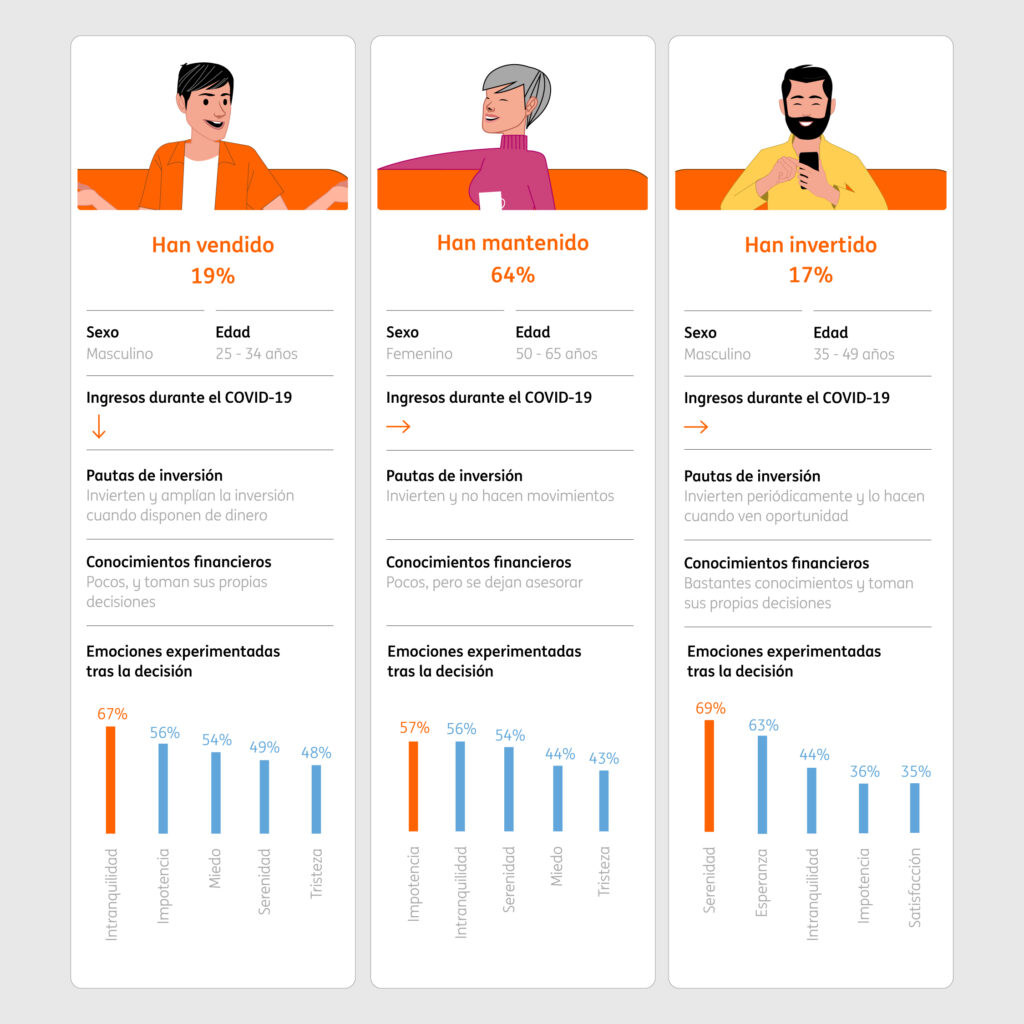
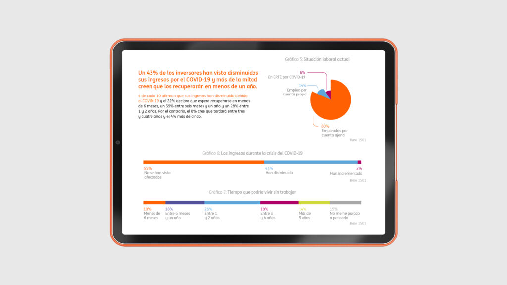
Financial communication is often dense, technical and easy to ignore. The challenge was to make complex information accessible across a wide range of digital touchpoints, from social media to internal communication, while maintaining consistency with ING’s visual identity.
The strategy
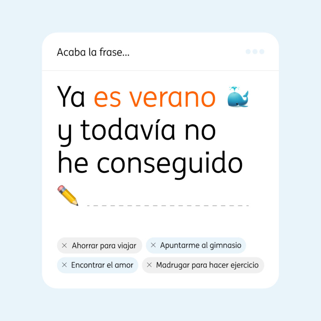
I designed visual systems that simplified information without oversimplifying the message. Through clear hierarchy, modular layouts, custom illustrations and motion, I translated complex financial topics into content that was easier to understand, navigate and share.
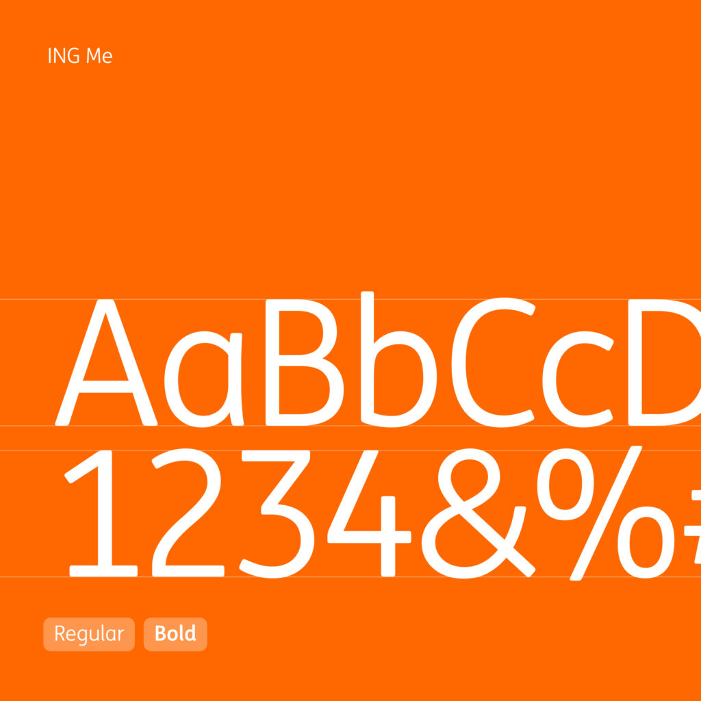
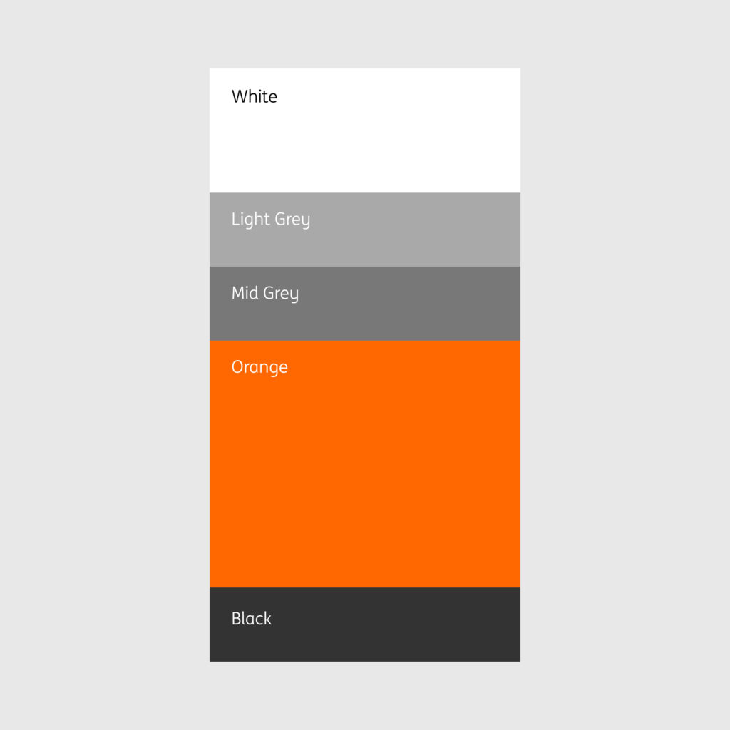
Alongside campaign work, I also contributed to the implementation of ING’s updated brand identity across digital assets, ensuring consistency while adapting global guidelines to local needs.

Outcome
The project strengthened ING’s digital communication by making educational and corporate content more approachable, visually engaging and consistent across channels.