The Challenge
Spain receives more visitors than ever, yet the world knows less about it than it thinks. Tourist flows are concentrated in a few destinations, a few weeks of the year and a few spending segments. The plan had to communicate this change of model, from attracting volume to attracting balance, to an international and professional audience, without falling into the visual clichés of tourism advertising. At the same time, it had to stay consistent with Turespaña’s institutional identity, and turn five objectives, nine programmes and a large amount of data into an experience that people would actually read.
Design Approach
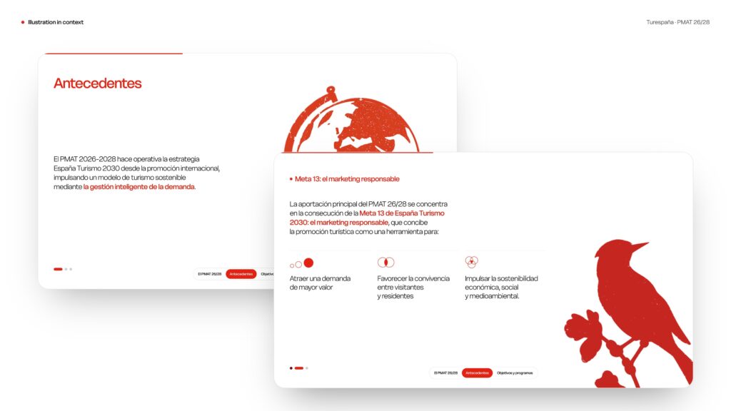
The identity moves away from conventional tourism imagery, evoking Spain through sensations rather than familiar landmarks. Built around three principles — close, evocative and clear — the visual language combines warm, contemporary typography, a restrained red and neutral palette, atmospheric photography and textured illustrations. Data visualisation is treated with clarity and precision, turning complex information into accessible visual narratives.
The digital experience was designed as a guided story, structured around a clear content hierarchy and a 12-column grid. A custom scroll engine coordinates independent timelines for each section, bringing typography, photography, cards and maps to life without scroll-jacking. A persistent navigation system maintains orientation throughout, while interactive destination cards, data visualisations and programme maps make the information engaging, intuitive and easy to explore.
Outcome
The result is a single, coherent system that takes the PMAT from a strategic document to a digital experience. It explains a complex change of model clearly, keeps Turespaña’s institutional voice and gives the plan a distinctive presence in international communication.